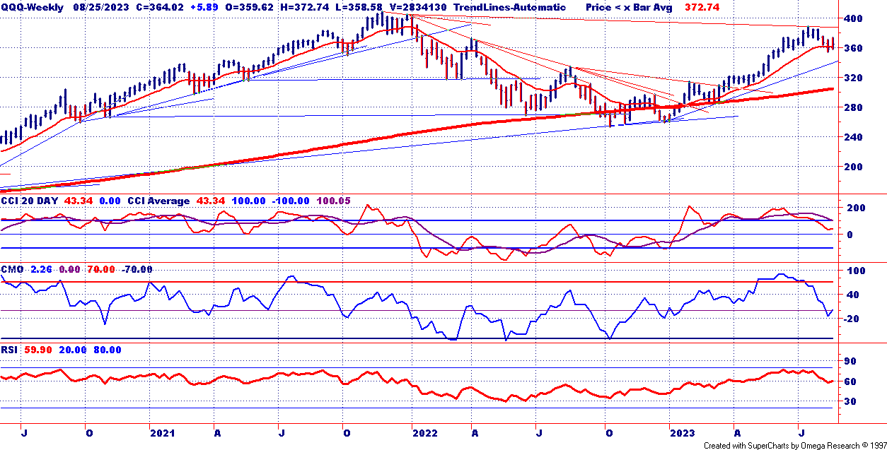
The persistent grind higher, today was no surprise.
One
headline adding weight: reports that U.S. consumer debt is hitting
record levels, with “buy now, pay later” even being used for groceries.
That’s another signal of financial stress in households, which traders
watch closely when assessing the sustainability of market rallies.
Meanwhile,
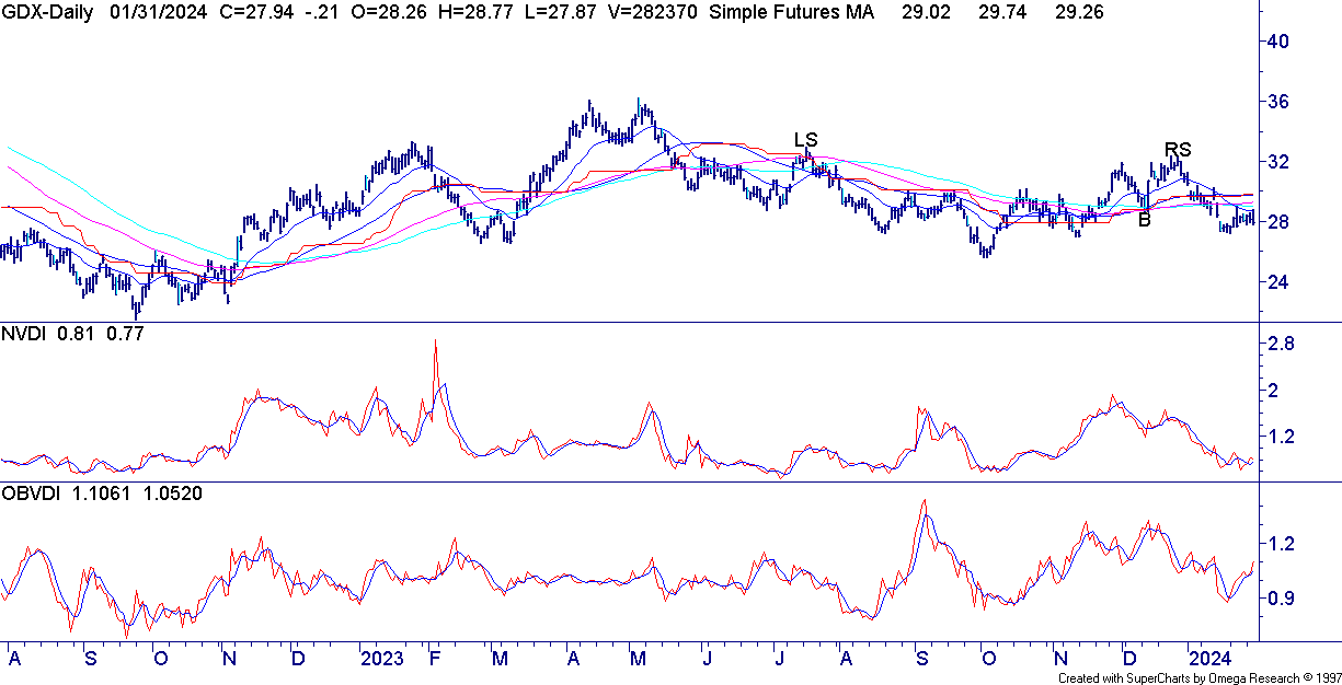
signs of greed are flashing in the precious metals space. Monthly
charts of GDX and SILJ show steep runs — moves that historically end
with violent reversals. It’s a reminder that while trends are
profitable, parabolic stretches can snap back fast.
Sector & Asset Highlights
Biggest Gainers:
- SILJ +5.24% surged as silver miners drew speculative flows.
- PBW +3.10% rallied with clean energy stocks catching a bid on policy headlines.
Biggest Losers:
- IBIT -2.63% slid as crypto-linked assets cooled.
- XHB -1.54% dipped, reflecting concerns about rising mortgage rates pressuring housing demand.
Bonds (TLT): Flat to lower — profit-taking continues after last week’s rate-cut enthusiasm.
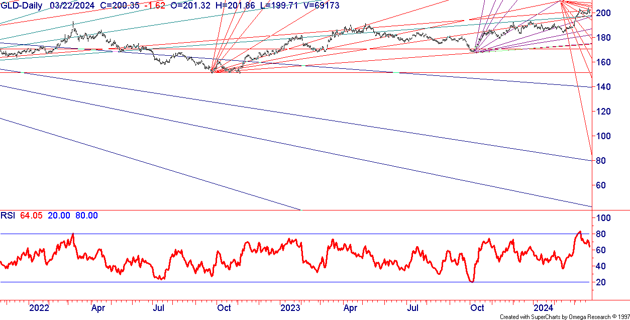
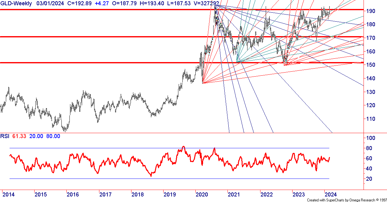
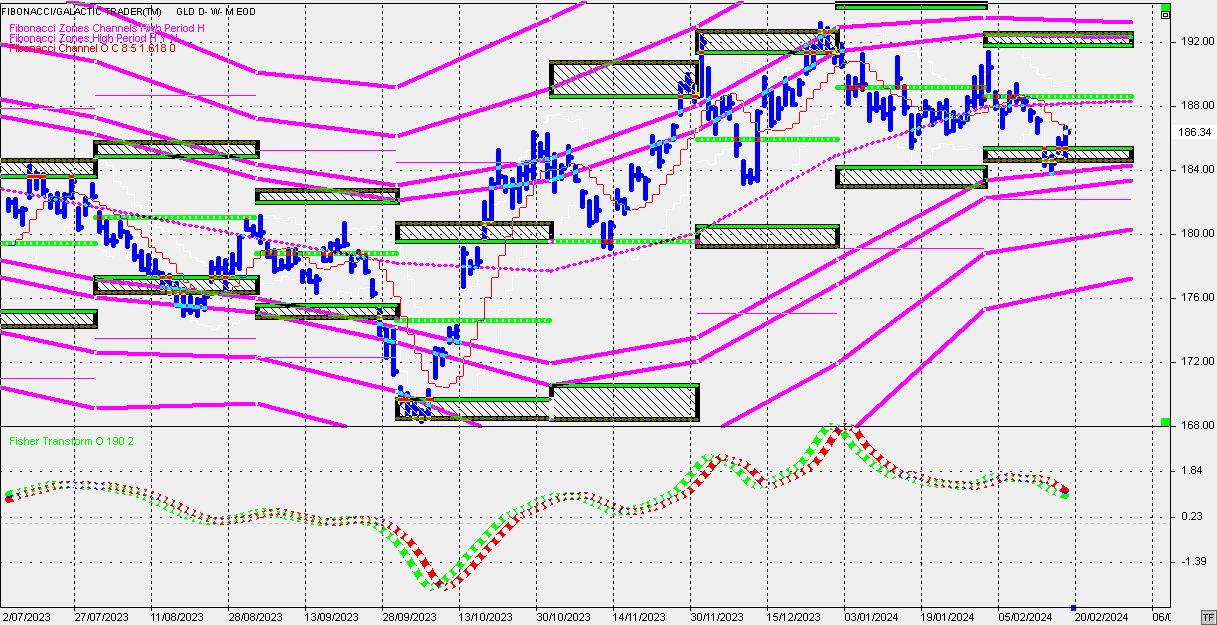
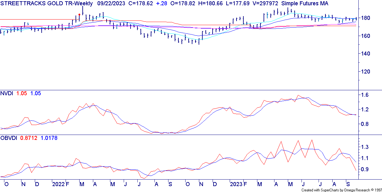
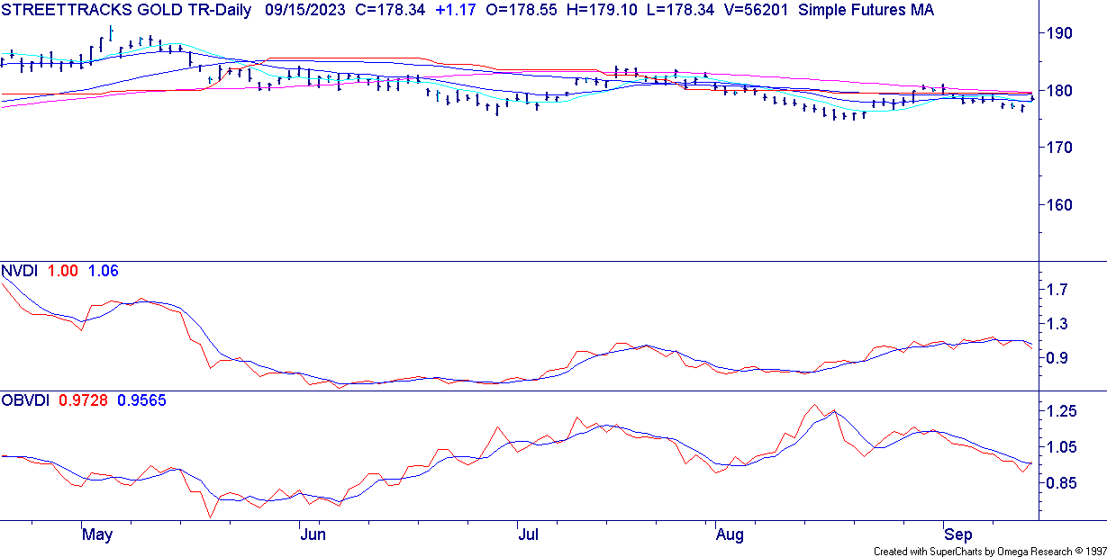
Gold & Silver: Both pushed higher intraday despite dollar strength. Seasonality and structure still favor further upside.
Crude Oil (USO): Down again, stair-stepping lower as sellers press each overbought pop.
Concluding Thoughts
Today
was more about digestion than direction. After a strong run, it’s
healthy to see a pause — especially with sentiment gauges like the
put/call ratio still flashing caution. Our positions remain in solid
shape, with profits already locked in.
The
key lesson: trends often end in excess. Whether it’s greed chasing
metals or call-buyers leaning too far one way, our discipline protects
us from getting caught in the reversal. As always, we don’t predict
every twist — we manage risk, protect capital, and let compounding do
the heavy lifting.
FREE ANALYSIS NEWSLETTER
Tom Lee is the new hero, but remember what happened to Cathie Wood in the same situation?
If
you have been investing for a few decades, you already know the market
spends a lot of years drifting higher. That slow upward tide is exactly
what makes the messages of Wall Street, the big advisory firms, and the
most televised gurus feel so comforting to hear, watch and follow.
Prices are up, sentiment is bright, and the loudest voices are usually
the ones saying stay the course, everything looks fine, this is the
time to be long.
And that’s exactly how
countless self-directed traders and investors end up carrying far more
risk than they realize — until it’s too late.
I
have watched and been part of this cycle repeat over and over since
1997 when I first started trading my own money. A new voice rises to
hero status in the media after predicting few market trends and moves,
the crowd follows, and portfolios load up on the same trade at the same
time. When it works, it feels like guidance and skill. When it stops
working, it looks like a decade of savings evaporating in a few brutal
months and that there was no strategy other than buy something – period.
If you want a sobering take on media and free opinions, then read this article “Why Free Market Analysis Can Cost You More Than You Think.”
This
article is about why that happens, how it keeps happening, and what a
different path and strategy looks like when you stop predicting and
start following price, and protecting portfolio positions.
The Seduction Of Up Years & Perma Bulls
In
many calendar years, the stock market finishes green. That simple fact
becomes the foundation for a lot of advice that sounds safe. Stay
invested, ride it out, time in the market, not timing the market. Those
slogans are easy to remember, they feel wise, and they are great at
keeping people in their seats when the orchestra is still playing.
But
slogans are not risk management. Up years lull investors into believing
they own a safety net. Then a garden-variety pullback arrives, and no
one knows if it is the beginning of a routine pause or the opening act
of a major bear market. Without a plan that follows price and adapts,
the default response becomes hope. Hope is not a rule, and it is not a defense.
I wrote in depth about this and how even smart investors blow up eventually in a bull market.
Media Heroes, Momentum Stories, and Herding Effect
Every
cycle has marquee names that capture attention and shape behavior.
During the 2020 to 2021 growth boom, Cathie Wood’s ARK Innovation ETF
became the emblem of high beta innovation, surging 152.8% in 2020, then
slipping 23.38% in 2021, and falling 66.97% in 2022 as conditions
flipped. By late 2022 the fund’s drawdown exceeded 75%, a stark
reminder of how quickly momentum can reverse when the regime changes.
Morningstar data cited by the Financial Times later labeled ARK the
“biggest wealth destroyer of the past decade.”
Today,
a different confident voice is front and center. Strategist Tom Lee of
Fundstrat is widely covered for consistently bullish market views and
high long-term targets, and he earned a lot of airtime with optimistic
calls through 2023 and 2024. That optimism resonates in rising markets,
its what investors want to hear, but investors still need a plan for
when the market turns down.
Media
rewards conviction, and audiences love a clean directional call. That
incentive structure pulls public commentary toward always-bullish, buy
and hold, stay the course messages. It gets clicks, it feels good, and
it keeps money in the market, and inside financial products.
This
is pretty much how all Wall St. money managers run their businesses.
And its just a matter of time before their long only, perma-bull
outlooks and strategies fail and they go from hero, to hated status.
Every major bull run produces a new financial hero who leads the charge
— until that same confidence leads investors straight into their next
account-destroying downturn. I have seen this happen repeatedly over
the past 25+ years it will continue to happen unfortunately.
When The Music Stops, Slogans Do Not Protect You
The
buy and hold messages that feel reassuring in uptrends keep you fully
exposed in downtrends, they do not tell you when to reduce risk, how
much to sell, or when to step aside into cash. They do not tell you
what to own if stocks and bonds fall together. For an investor in, or
near, retirement, that is not a plan, it is an open invitation to
sequence-of-returns risk.
A 30 percent
drawdown on a 1,000,000 dollar nest egg is 300,000 dollars gone, and it
takes about 43 percent just to get back to even. A 50 percent loss
requires a full 100 percent gain to climb out. Those are not academic
numbers, that is a canceled retirement date, a downgraded lifestyle,
and years spent repairing instead of compounding. A TV soundbite is not
a buy or sell signal, just as hope is not a hedge, risk management or a
strategy.
When the “All Weather Portfolio” Stops Working
Even
sophisticated frameworks can grow complacent when a single macro trend
lasts decades. For the last 40 years, falling rates helped bonds
cushion stock drawdowns. In 2022 that assumption broke. Both stocks and
bonds fell together, and a classic 60/40 portfolio declined about 25%,
one of its worst years on record. Long-duration Treasuries finished
roughly 30% lower, and even intermediate bonds dropped around 10%,
which is exactly the environment traditional stock-bond diversification
was meant to offset.
Risk parity
strategies, including high-profile “all weather” style allocations,
faced the same headwind as correlations flipped. Industry analyses
flagged 2022 as a notably difficult year for risk parity, and
independent research on Bridgewater’s and Ray Dalio’s All Weather fund
reports a loss of about 22% that year, underscoring how a bond shock
can ripple through models built on long-standing relationships. The
takeaway is not that diversification is dead, but that static
allocations can struggle when the regime changes.
The
lesson is simple and humbling. Long streaks breed assumptions,
assumptions become blind spots, and blind spots turn into losses when
conditions flip. A rules-based, price-driven approach does not assume,
it observes, measures, and adapts.
Buy And Hold Sounds Wise, But It Hurts In Real Life
Buy
and hold is clean on a chart, messy in a household. A 30 to 50 percent
portfolio drawdown is not just a number, it is canceled travel, delayed
retirement, and a spouse asking why there was no plan. Many investors
in their 50s and 60s have lived this more than once. They do not need
another pep talk. They need a framework that treats every correction as
if it could be the start of something bigger, then lets price prove
otherwise.
What Asset Revesting Does Differently
Asset
Revesting is what I believe is the most efficient and safest way to
invest. It’s been used since 2001 and is in a category of its own in
the investment world. When using it, I do not predict, I do not call
tops, and I do not try to nail bottoms. It allows me to follow price, I
position with strength, and I manage risk as if the next pullback could
be the first step of the next bear market. That posture is not fear, it
is discipline. It is also how members sidestep the disasters that ruin
compounding.
Here is the heart of it, stated plainly.
- Risk first, returns second. Many investors focus on what they might make, Asset Revesting focuses first on what could be lost if a move fails.
- Follow, do not forecast. Positions
are taken after strength is confirmed, not when a story sounds
exciting. Positions are reduced or exited when price deteriorates, not
when a talking head changes a narrative.
- Be willing to go to cash. Cash is a position. Patience pays dividends, literally and emotionally, while the next high probability setup forms.
- Profit from declines when conditions warrant. When
downtrends are in force, the playbook includes assets and structures
that can rise while stocks fall. No dramatics, just rules.
A Different Conversation For Investors 50+
If
you are 50 plus, you are not trying to win a trading contest. You want
clarity, control, and calm. You want to grow without giving back years,
and you want someone to take the emotion out of the decisions that
matter.
I hear versions of these stories every week.
Mike, 63, manufacturing executive, spent
two bull markets believing he had it figured out, then watched a third
of his savings disappear, twice. He told me, I do not need the thrill
of a perfect bottom, I need a process that keeps me off the rocks. Once
he embraced exits as a sign of strength, not weakness, his blood
pressure and his drawdowns both came down.
Karen, 58, small business owner, tried
to do everything herself. She took two courses, subscribed to three
investing newsletter, and still made reactive decisions based on
headlines. Her turning point was not a magic indicator. It was a
checklist that guided her and said, enter only after strength, reduce
when momentum fades, step aside when trend structure breaks. She calls
it boring in the best possible way allowing her to free up time and
sleep better at night.
These are not
promises, they are patterns. Investors who trade narratives ride the
mood of the crowd. Investors who follow price accept small, controlled
inconveniences to avoid big, life-changing setbacks.
The Hidden Cost Of Perma-Bull Messaging
Always-bullish
narratives feel optimistic, and optimism is attractive. That is why
advisors and asset gatherers repeat it. Their business model rewards
assets staying put. But optimism without an exit rule is not a
strategy, it is a slogan. For investors 50 plus, permanent bullishness
is a ticking time bomb, because sequence-of-returns risk turns a
routine drawdown into a smaller lifestyle, delayed retirement, and
years spent repairing instead of compounding.
When
markets finally trend down, the only tools left in the perma-bull
playbook are phrases designed to keep clients from leaving.
By contrast, the mindset I wrote about in my recent piece, “Why Being Called a Perma Bear Is the Best Compliment I Could Get,”
is not about shorting everything or sitting in cash forever. It is
about being permanently prepared, not permanently negative. Perma-bear
thinking keeps risk top of mind, follows price, stays long while
strength persists, reduces or steps aside when deterioration appears,
and is willing to profit from declines when downtrends are in force.
That posture protects capital first and lets growth compound second,
which is the only order that works across full cycles.
How I Decide, Without Guessing
People
ask me, what do you look at if you are not predicting. The answer is
simple, and it is the same across stocks, sectors, commodities,
currencies, and bonds.
- Trend structure, is the sequence of highs and lows advancing or deteriorating.
- Momentum behavior, is impulse expanding or stalling.
- Relative strength, is this asset leading or lagging better alternatives.
- Risk parameters, are position size and exit levels aligned with current volatility.
None
of this requires a forecast. It requires acceptance. I accept that any
pullback can become a bear market, so I react to deterioration early. I
accept that any breakout can fail, so I size for that reality. I accept
that my opinions are irrelevant next to the price, so I trade the price.
What This Means For The Next Downturn
Another
major correction will come. No one knows the day. What matters is how
much of your savings is exposed when it starts, and how quickly your
process can get defensive and stay disciplined while others
rationalize. In general, when investors follow price with defined
exits, drawdowns stay small enough that new opportunities can be taken
without fear. When investors ride out declines because a slogan told
them to, recovery becomes the plan, not growth.
So Now What?
If
you are wondering what to do next, I can share something that I do with
my own money, which you too can do that can protect and grow your
account at the same time, and is nearly unheard of in the financial
world.
It’s a method of investing called Asset Revesting. I wrote a book on this and
it exists to close that gap with a rules-based, risk-first,
price-driven approach that adapts to the current market environment,
up, sideways, and down. It is not about beating every rally. It is
about keeping what you make, allows you to compound your growth
multiple times each year, avoid corrections, crashes and bear markets,
so you can relax, sleep better, and actually keep the gains you’ve
worked hard to earn — without large downside risk.
Concluding Thoughts For The Seasoned Investor Who Is Worried And Needs Help With Protection & Growth
You
have already lived through enough cycles to know how this movie ends
when there is no plan. You do not need a new guru, you do not need a
bolder prediction, you do not need a slogan. You need a process that is
humble enough to follow price and firm enough to protect you when it
matters.
That is what I do, every day, for myself and for the investors who choose to follow along. I share my Adaptive Compounding Strategy (ACS) with a select group of investors.
Stay logical, stay calm, stay protected.
Chris Vermeulen
Chief Investment Officer
TheTechnicalTraders.com
P.S. To learn more, book your free call with my team now! Pick a day and time here.